
Bonnie Watson
Graphic Design Portfolio

Sales Piece for Upcoming Aiken Standard Bound Coloring Book
The director of our advertising department requested that I create a sales piece for our advertisers to use to sell a current project of the Pagination team at the Aiken Standard.

Marketing Materials for Graduate Program
I created an informative, informational flyer that would be given out to potential students looking for pursuing their graduate degree with a prominent business school here in South Carolina. The flyer is two sided, with one side focusing more on eye-grabbing graphics with generalized information, and the other side being including more details about the various programs that the school offers.


Marketing Materials for Real Estate Company
I had the opportunity to create designs that included marketing materials for a local real estate company in the CSRA. The designs include a social media creative intended to be put on Facebook or Instagram, a flyer sheet that would ideally be handed out at open houses or to generate interest to potential buyers, a guidebook showcasing features and areas of the house, and a postcard that would be mailed to clients letting them know a new listing had just posted.


Creatives for Buck Cancer Foundation
As a volunteer graphic designer, I create simple designs intended to be used as social media creatives that could be posted on Facebook and Instagram.


Greenleaf
“Better Living Through Chemistry”
This assignment involved creating a graphic annual report that involved the use of chemistry. The report shows a professional but simplistic theme. The logo was designed from common shape in nature – the molecule. The nucleus is a leaf to represent the company’s green commitment to nature. The font was chosen because it is modern and innovative and gives a technical look to the report.


Miscellaneous Posters
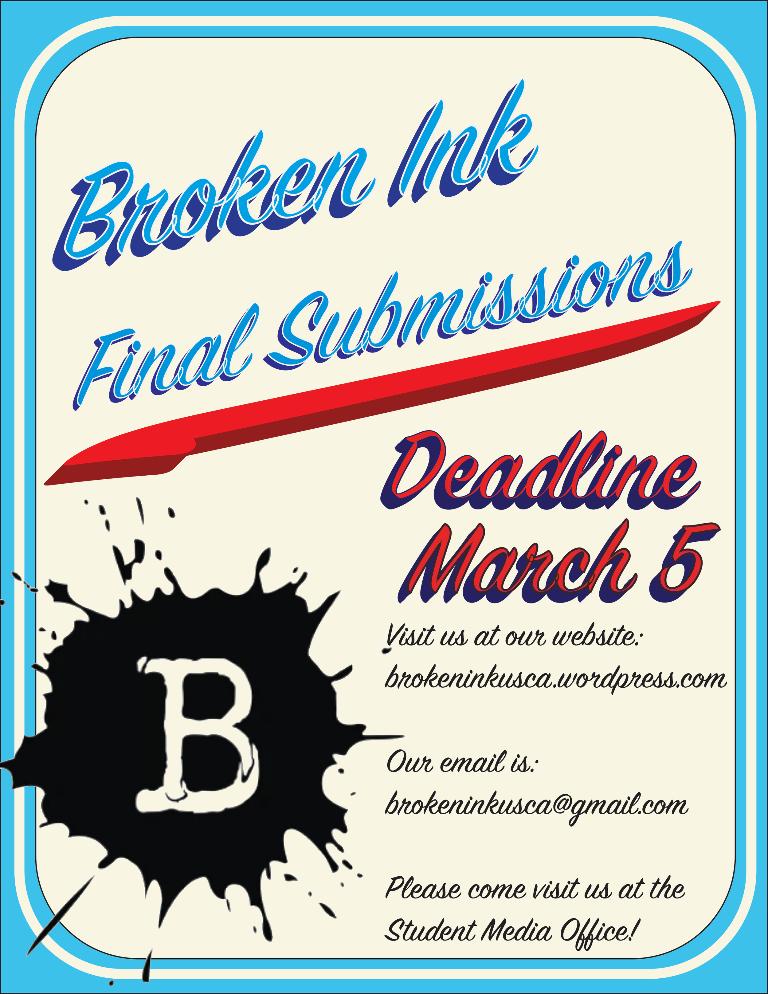
Some of these posters were created for Broken Ink, a nationally-recognized award-winning visual and literary arts magazine. Other posters were created for various class assignments. They represent different time periods and styles, such as Dadaism and German World War II modern art.


Local Logo – The Book Tavern
These logos were designed for a local business for potential rebranding. The large, bold text-based logo is the strongest because of the basic yet impactful text. It still retains the imagery that could potentially be used as an icon for marketing. The idea for the lantern came from the concept of rustic or “old world lore,” such as Lord of the Rings. These novels, along with Harry Potter, evoke certain atmospheres and images.

Word Poster Photography
This photograph is a self portrait with lighting that emphasized the body above the shoulders. Text was chosen to wrap around the image. The text chosen was from a previous submission published in USC Aiken’s Broken Ink Literary and Visual Arts Magazine.

White Space Paint Company
The concept behind this assignment was a mock paint catalogue. The cover is 80-90% white space but showing the name of the paint company. A variety of colors were chosen rather than one to show the diversity of paint colors. The subtle rainbow drop splash was created in Photoshop. Paint names were inspired by common experiences in daily life.


Castle Lodge Catalogue/Brochure
This assignment was to create a hotel based upon a specific typeface, research the typeface, and somehow incorporate it within the design. The particular typeface here was Optima, chosen for its modernity but traditional appearance to show off the hotel’s theme – a refurbished Scottish castle that maintained its historical presence but also provided guests with modern-day utilities.


